GUESS WHAT!
I was in the top 3!!!!! :)
I was so excited. We are actually still waiting to hear back to see who won, so hopefully it will be mine! I am so happy to be in the top 3 though, at least. Yay!
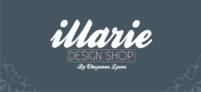
It's funny though, because they actually picked the concept of mine that in my opinion, was one of my weaker designs. Oh well, whatever works for them. They said they wanted a script font, so that's what I used. Here is what they chose!
{CLICK ON THE PICTURES TO SEE FULL/GOOD QUALITY}
Just trying some diff color schemes...


Tried a couple variations of their choice. If I am the winner, I'm not sure which one they would use.

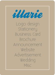
Business Card


No comments:
Post a Comment